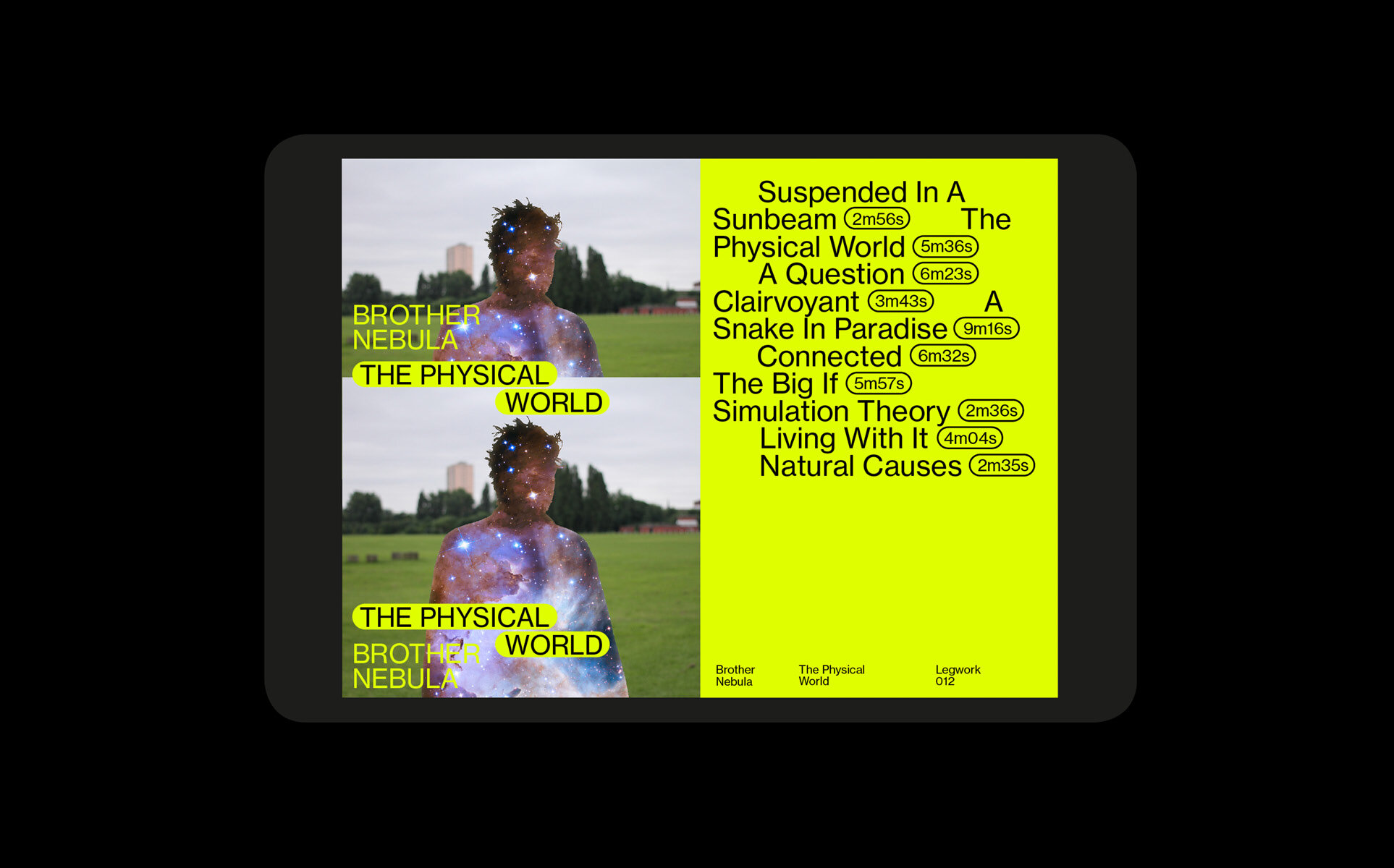
I created a typographic system that took inspiration from the way dance routines are recorded on paper. To enhance the classic feel of the brand, the fonts remain quite controlled and restrained, offset by a typesetting style that can be playful and free, moving through compositions like a choreographed routine. Connected by arrows and lines it allows for contemporary, pleasantly awkward layouts to remain legible.


